
The Design Brief® | Volume XVII | Design Elements: Pattern and Texture

©️ Dakota Design Company 2017-2025 | All rights reserved. This content may not be reproduced, distributed, or used without permission.
WRITTEN BY DR. GLORIA for DAKOTA DESIGN COMPANY
Here we are completing our series on the Design Elements. The elements of design are like the ingredients that a designer adds in just the right amounts to arrive at a delicious finished product.
💌 Want my best insights and strategies delivered weekly? Join The Weekly Install® — it’s free. Sign up here.
Although the list of the design elements varies by author or theorist, I consider these to be the definitive design elements:
LINE
SHAPE
PATTERN
TEXTURE
COLOR
LIGHT
We have covered several of these in previous editions of The Design Brief®:
In today’s edition of The Design Brief®, we’ll delve into using PATTERN & TEXTURE to manipulate a final design aesthetic.

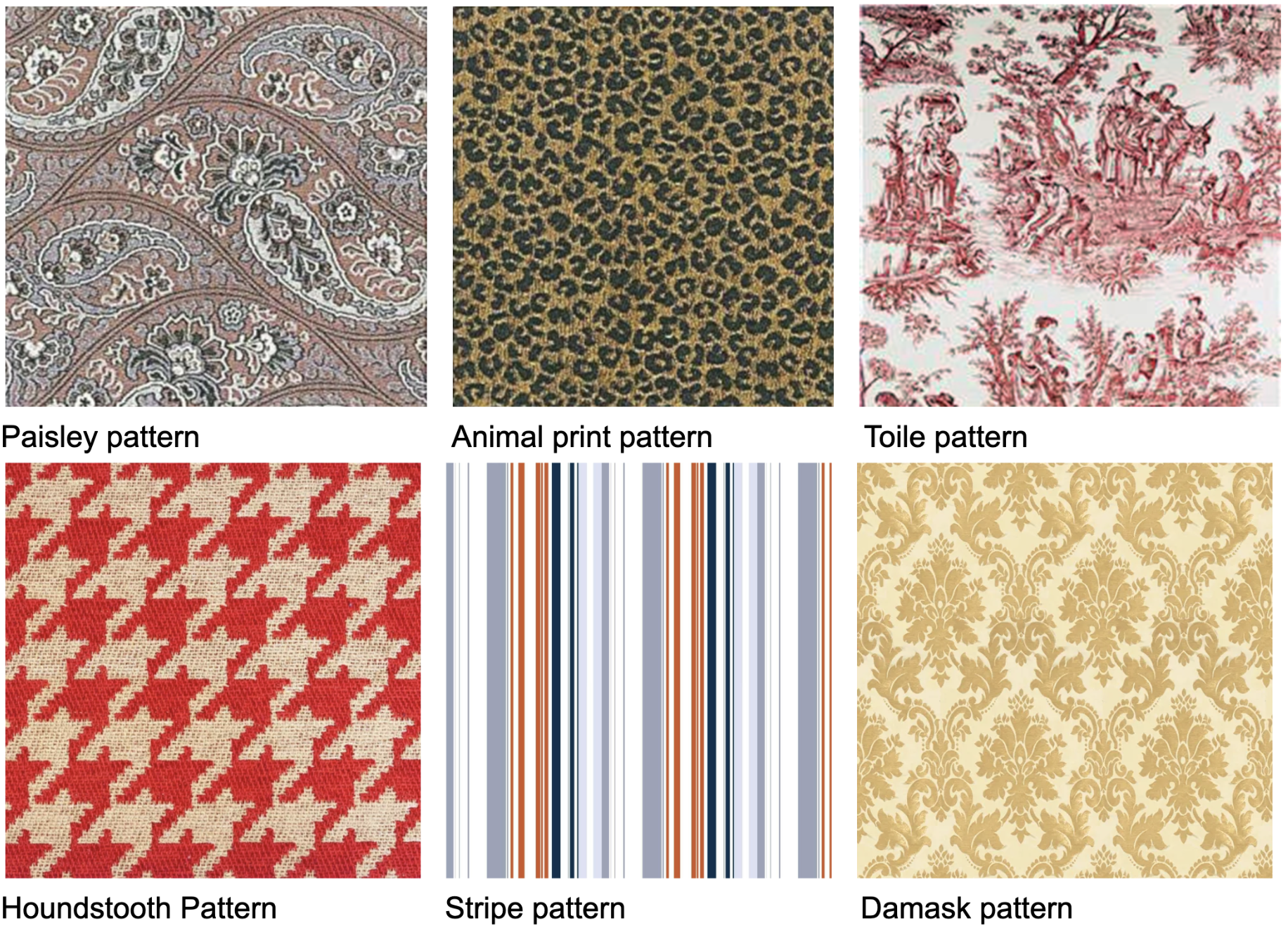
A PATTERN is the repetition of a motif, shape, image, or figure repeatedly on a field or background, and used on a wallcovering, textile, or rug. The key about PATTERN is that a visual element is repeated across a field, rather than randomly placed.
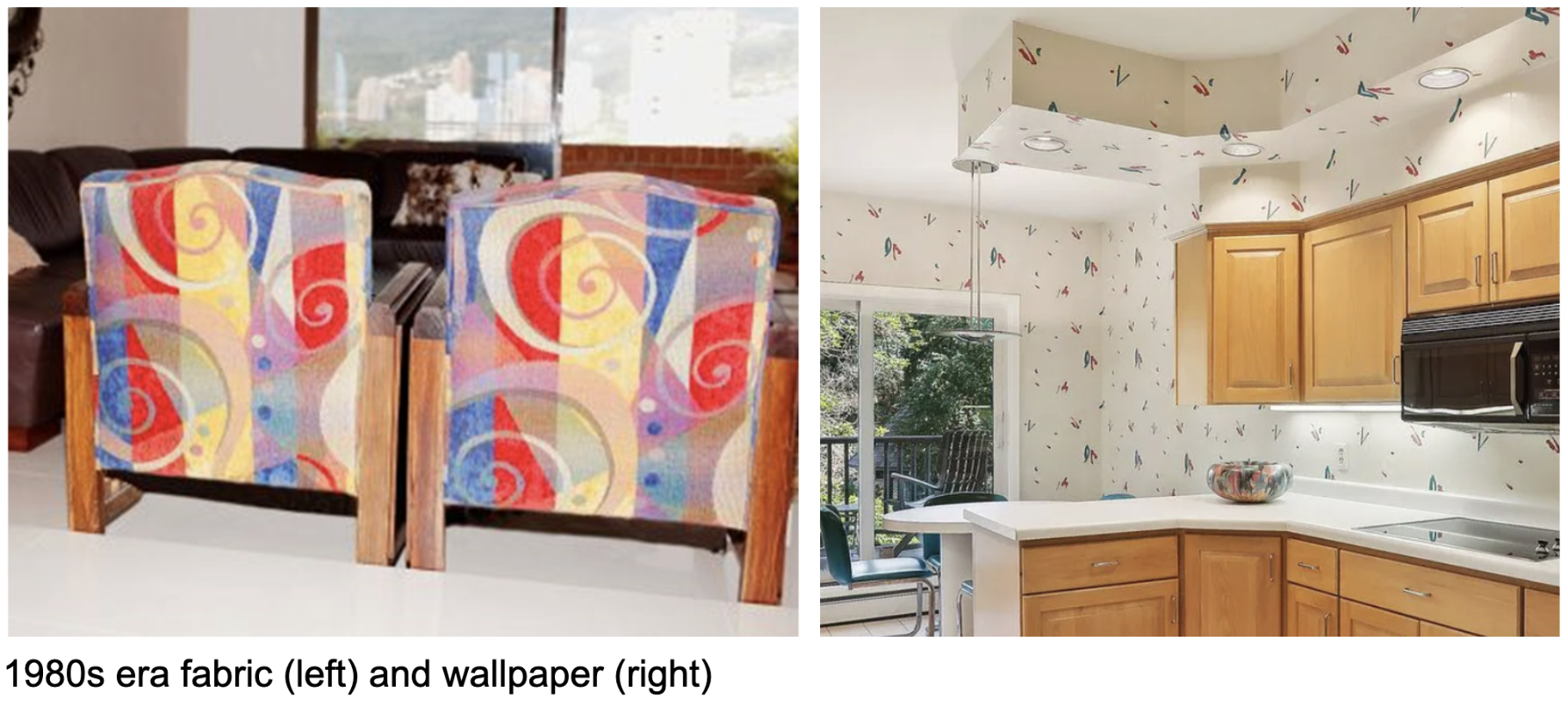
Patterns may be nature-inspired, or maybe organic, geometric, or abstract. Patterns and pattern types fall in and out of favor over time. It is fairly easy to identify the era of a space from an existing wallcovering pattern, or the age of a piece of upholstery furniture or a drapery by the stylistic qualities of its pattern. Pattern trends are always changing. But it is hard to discern the pace at which pattern trends are continually evolving—until you see a pattern from a bygone era. THEN you realize how much stylistic pattern trends have changed!
On the other hand, some patterns are quite timeless, and always seem to remain in style:
Floral patterns also seem to be eternally current, although the scale and degree to which they are realistic or stylized evolves. Currently, highly detailed floral patterns—much the same as were all the rage in the 1980s—are back in style:

Whereas a decade or so ago, we were seeing much less realism (more stylized interpretations) in floral patterns:

Designers need to consider several factors when choosing and applying patterns:
Scale
Direction
Repeat
Mixing of patterns
The scale of a pattern can affect the final aesthetic, as shown in the image below. At the smaller scale, this floral pattern is more traditional and conventional. At the larger, exaggerated scale, the look is more contemporary and striking.

Pattern direction is also an important consideration. Whereas striped draperies are typically done with vertical stripes, horizontal stripes present a striking, and more unconventional look.

When specifying patterns for upholstered pieces or draperies, there are two directional considerations:
the direction that the pattern is applied to the fabric between finished selvage edges
and whether the fabric needs to be applied in a standard direction or railroaded in order to achieve the desired effect.

An important consideration for estimating quantities of fabrics and wallcoverings (perhaps a topic for a future blog!) is the repeat on a fabric pattern: the distance from the start of the pattern to the end of the pattern, going both up and down (vertical repeat) and side-to-side (horizontal repeat). These two repeat distances will be provided on the fabric or wallcovering labeling.

The artistry in working with patterns comes in a designer’s ability to mix patterns effectively. The general rule-of-thumb is that there needs to be some commonality in either the color, the scale, or the motifs of the patterns being combined.
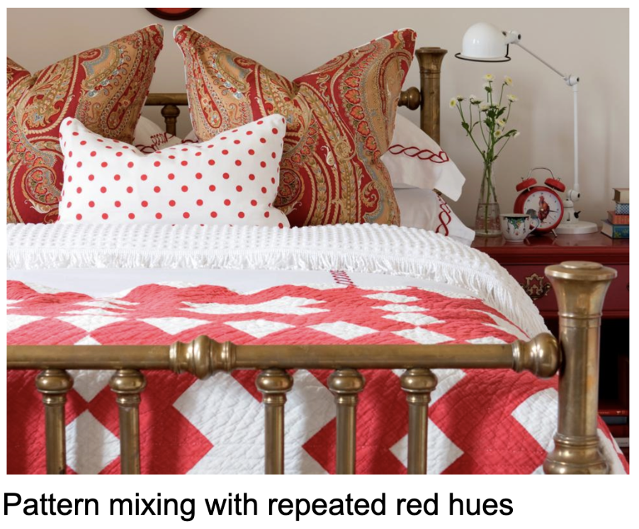
But very talented and creative designers can effectively mix patterns outside of any prescribed strategies, and create very innovative combinations of decor elements.

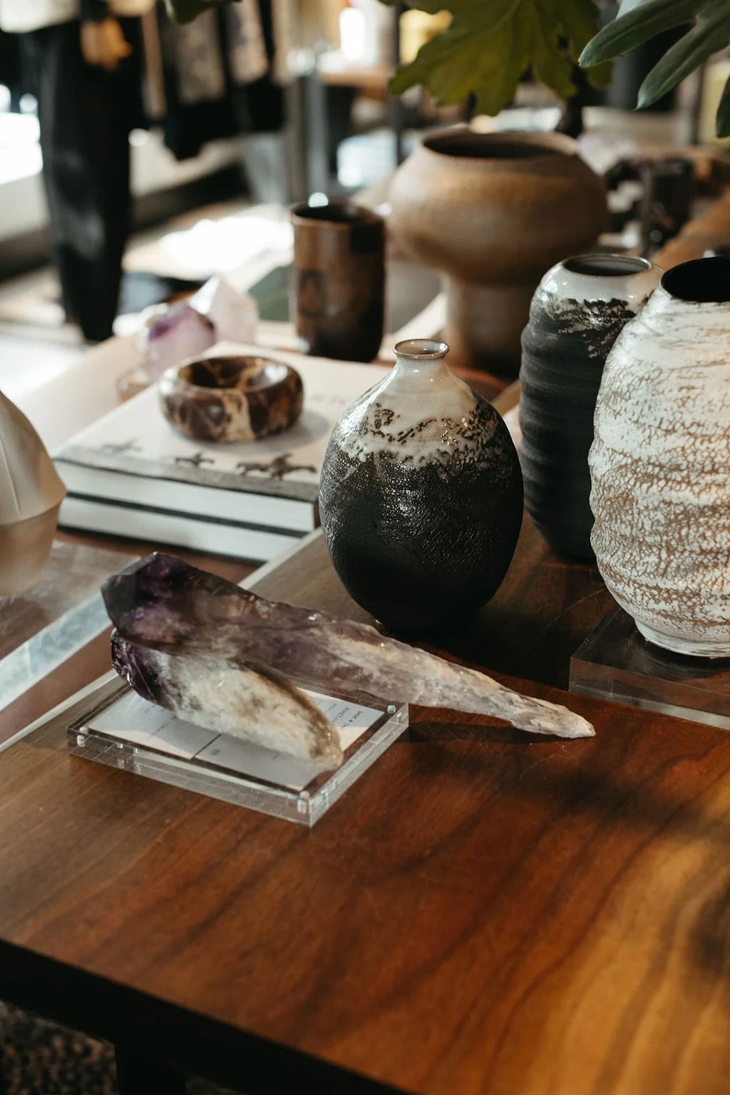
TEXTURE is a different animal from Pattern. But both are used to create visual interest in a space. TEXTURE is the three-dimensional quality of a material or surface that can be either felt or seen. A tactile texture is one that can be experienced by touch. A visual texture is one that may have no tactile qualities other than being smooth, but appears to have a significant textural quality.
These surfaces have distinctive tactile qualities that can be felt with touch:

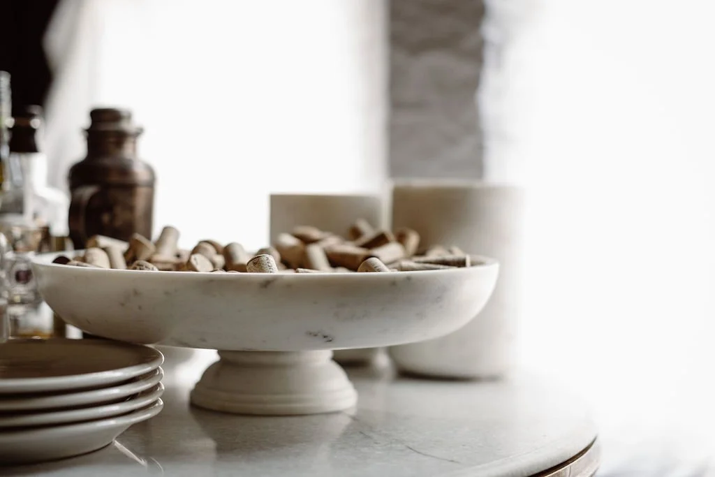
Some materials have very smooth tactile textures, but are visually rich. These are said to have VISUAL TEXTURE.
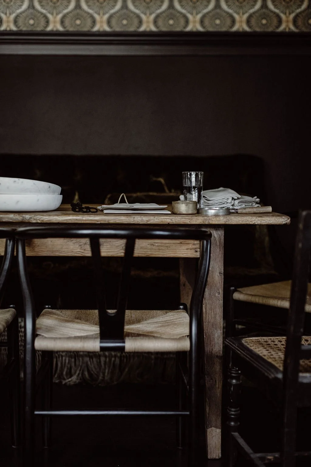
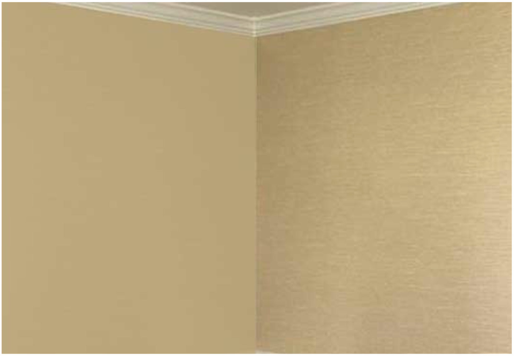
Surfaces that have tactile or visual textures are much more visually interesting than surfaces that are flat. Note the flat, painted surface on the left, compared to the wall-covered surface on the right, which has both tactile and visual texture.
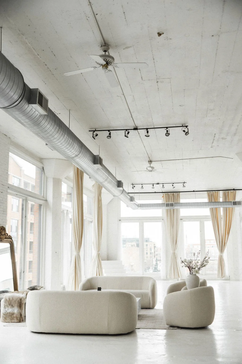
Texture becomes even more important in spaces with neutral, muted, or monochromatic color palettes. The plethora of textures in this neutral bathroom make it very visually rich.

Both light and distance affect our perceptions of texture. When a light source is placed so that it grazes a textured surface, the quality of that surface is visually emphasized.

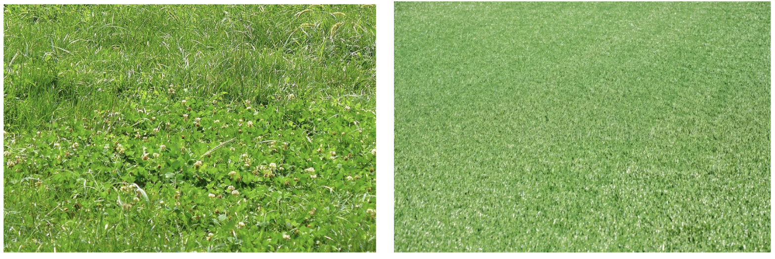
The further the distance a textural surface is viewed from, the more the textural quality will be lost to the viewer.
Both PATTERN and TEXTURE are important tools designers use to create visually interesting spaces. Perhaps more than any of the other design elements, PATTERN and TEXTURE add the outstanding visual importance to particular pieces in a space. Often, homeowners are cautious about using attention-grabbing patterns and textures, and designers need to provide a nudge to fully utilize these important design elements.
Want to explore more issues? Here are a few favorite past editions:

Want The Design Brief® delivered straight to your inbox?
If you liked this email, be sure to sign up for The Design Brief®, our complimentary publication that gives you bite-sized lessons on all the technical interior design topics you didn’t learn (or forgot) from design school—straight from our resident tenured interior design professor!