
The Design Brief® | Volume XII | How Interior Designers Use Color to Change the Perceived Size of a Room

©️ Dakota Design Company 2017-2026 | All rights reserved. This content may not be reproduced, distributed, or used without permission.
WRITTEN BY DR. GLORIA for DAKOTA DESIGN COMPANY
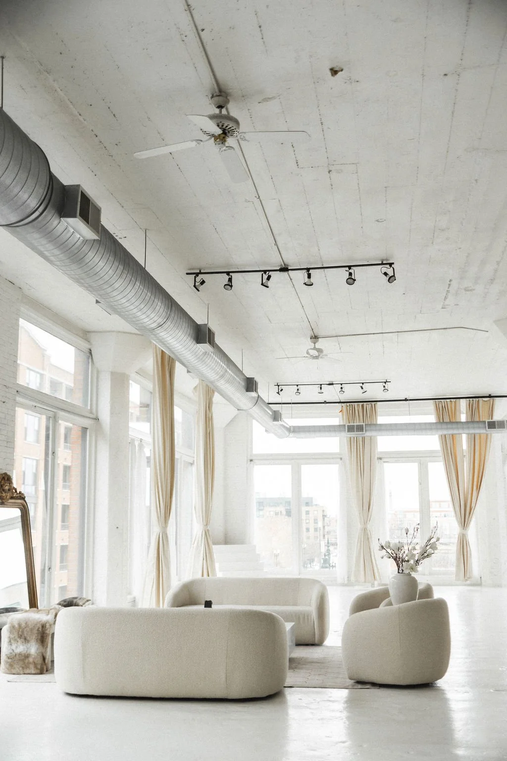
Of all the tools in an interior designer’s toolkit, color might be the most powerful. Not only does color provide the mood and liveliness in spaces, it can also be used to alter our visual perception. Particular tints and shades of colors used in combination can create the perception of more (or less) space than actually exists, produce an increased sense of openness, highlight and draw attention to one wall over the others, or, conversely, create the sense of a more constricted, cozy, or comforting space.
The Basic Rule
This post builds on our two earlier color theory posts (this blog and this blog) by going deeper into one specific application: using saturation, value, and contrast to alter the perceived size of a space.
This effect of altering the perceived visual size of a space—and creating illusions of either greater expansiveness, or conversely, more intimacy—is based on a simple notion: that dark colors advance towards us visually, while pale colors seem to recede away from our field of vision.
Darker colors close in the perceived space (bringing that colored surface towards our view), while light colors create an increased sense of openness (moving that colored surface away from our view). This is a dependable rule-of-thumb that can be used very successfully for selecting paint colors for walls and ceilings to arrive at slight manipulations of perceived space.
But there are other factors at play as well, making color usage a bit more complicated. Consider that bright vivid colors, such as a fire-engine red, or bright sunshine yellow, will also seem to advance towards us. So, which is it that we should use if we want walls to appear to move forward into the space? Dark and saturated, or bright and vivid???? Either, actually.
Darker colors tend to advance towards us visually more than light colors, but not always. In some conditions, the opposite is true. Darker paint colors can also be used in a room to recede visually, creating a sense of depth that makes the room feel more expansive. The trick is that there need to be other things in our visual field that are brighter or stronger visually that will allow the darker colors to take a back seat, and recede by contrast. The contrasting elements—whether they be dark or light—receive our attention.
When the Rules Break Down
And let’s consider another dichotomy that confuses the color use issue for us. Consider that wearing black or dark colors can make you appear more slender. There is a diminishing effect to black and dark colors that creates the sense of reduction. A black square on a white background will appear smaller than the same sized white square on a black background. Black seems smaller, white seems larger.
So which is it, do dark colors advance and move forward, or do they diminish and look smaller??? Do light colors recede and move away visually, or do they enlarge visually??? Well, it depends.
The thing about color use is that many of the visual effects depend on context, adjacent colors, particular hues used, combinations used, the amount of contrast, and many other things in combination. Particular choices of hues, the brightness or saturation of color, and the amount of contrast among colors used can all deceive our eyes a bit into perceiving more or less space than actually exists.
Seeing It in Action: Room-by-Room Color Comparisons
So, let’s look at some room renderings, identical except for the hues used on walls and ceiling.

Room A has a lighter ceiling than room B, which makes room A’s ceiling seem a bit loftier, for more expansiveness. Room B gives the perception that the ceiling is slightly lower, because the ceiling color is darker. That adds a bit of intimacy to the perceived space in room B. Room B doesn’t seem quite as open and airy as Room A. In this case, the theory of darker colors advancing applies: the perception of the ceiling height differs based on the lightness or darkness of the ceiling color.

The same is shown here—two rooms with the same wall color, but the ceiling color is darker in Room B. Room A is being stretched vertically compared to room B. The lighter ceiling color recedes away from us visually, and looks taller. The other thing that happens in room A is that the ceiling receives more visual attention, because it contrasts more strongly with the wall colors. Sometimes that is not desired. Sometimes it would be preferred to have the ceiling blend in a bit more with the overall room.
Pro tip: designers will sometimes specify to the painter that the standard ceiling color be cut with 20% of the wall color (80% ceiling white, 20% wall color), to arrive at a ceiling color that does not have quite so much contrast with the walls, but rather blends with the darker wall color a bit.

In the images above, room B has a darker ceiling and walls compared to room A. Overall, room A seems more expansive, room B seems more cozy and intimate, because the darker colors advance towards our view.

Here, in room B, the rear wall advances forward, making the space seem shallower front to back, compared to room A. Again, this is an example of a darker color advancing towards us. And, the rear wall in room B grabs our attention, and becomes a focal point. But another reason the rear wall moves towards our view visually is because of the contrast with the side walls. Contrasts, whether dark or light, tend to advance towards us.
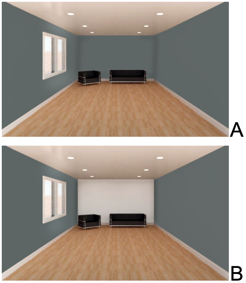
Here, the only difference between these two rooms is the color of the back wall. The light back wall in room B advances rather than recedes. Why is the rule-of-thumb broken here? Because there is a great deal of contrast between the white wall and the other walls. Because contrast exists, the white wall has more visual emphasis, and therefore advances visually. It also becomes a focal point in the room.
General Strategies for Using Color to Manipulate Perceived Space
Where the desired effect is for darker walls to recede to create a greater sense of expansiveness, use colors that are low in intensity, that is, they include a lot of gray. We would call low intensity colors muted. Burgundy rather than red, dusty rose rather than pink.
Another effect that can make dark colors recede is using lighter colors as contrast. A dark wall will recede if the furniture or other elements in front of it are light.
When the goal is to make dark colors advance, or move into a space visually, use colors that are vibrant and saturated, that is, they are purer hues: blue-er blues, green-er greens.
If the desired effect is for light colors to recede, use them generally all over in a room.
If the goal is to make light colors advance, or move into a space visually, create contrast with other walls or elements, so that the light color is emphasized.
So, if the geometry of a room is less than ideal in one particular way, use of color on the walls and ceilings may be an effective way to manipulate the perception of space, either for the illusion of greater spaciousness and expansiveness, or for a sense of greater proximity and intimacy.
Want to explore more articles from Dr. Gloria? Here are a few favorite past editions:

Want The Design Brief® delivered straight to your inbox?
If you liked this email, be sure to sign up for The Design Brief®, our complimentary publication that gives you bite-sized lessons on all the technical interior design topics you didn’t learn (or forgot) from design school—straight from our resident tenured interior design professor!