
The Design Brief® | Volume IX | Color Theory 01 for Interior Designers: A Guide to Color Language and Attributes

©️ Dakota Design Company 2017-2025 | All rights reserved. This content may not be reproduced, distributed, or used without permission.
WRITTEN BY DR. GLORIA for DAKOTA DESIGN COMPANY
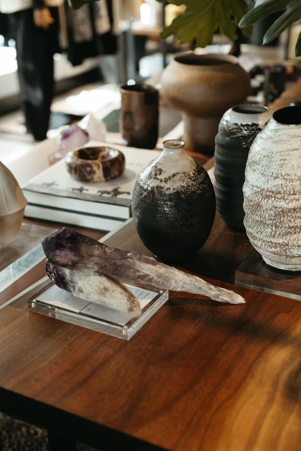
Interior designers generally have a very good color sense. It’s often one of the reasons they’ve pursued a career in the field in the first place: they can manipulate color choices and materials into very pleasing combinations. It’s quite an uncanny ability and one most people (non-designers) really struggle with.
In my years of teaching interior design college-level courses, I have grappled with the relevance of color theory in developing color competence. This is for several reasons, not the least of which is the overriding question of theory versus application. I’ve pondered these questions:
Is it important to understand what analogous, complementary, and triadic color schemes are, when NO interior designer I have ever met begins building a palette based on these as goals?
The color wheel—as a framework for understanding color relationships—is important for artists and painters who mix paint pigments to arrive at secondary and tertiary colors, tints and shades, but how relevant is it really for interior designers who typically select from already manufactured fabrics, paint colors, rugs, and wallcoverings?
There are no absolutes with color application, no definitive rights or wrongs. As with any creative pursuit, a successful design may result from breaking or bending some of the standard strategies and manipulating variables in innovative ways. Therefore, how can color theory be taught in a way that allows freedom from restrictions?
So, in my teaching, I have always struggled to understand whether teaching color theory is really building false parallels between theory and application.
When interior designers don’t actually make color choices based on theory, how important is color theory really?
The relevance of color theory to interior designers is more related to how color is perceived and appreciated by clients, rather than the textbook definitions of color vocabulary terms. But the educational approach to teaching color theory has always been that interior designers will become more well-versed in its applications through an increased understanding of the properties of color.
Because an article about color theory would be remiss without covering color language, this blog does cover the color theory basics, regardless of their relevance to interior designers.
Certainly, interior designers can only benefit from the knowledge of color theory.
And, it IS important that interior designers can communicate effectively about color. Therefore, this post will cover foundational theory, color language, and color attributes.
→ For a deeper look at theoretical implications that do affect daily design practice and application, read the follow-up to this post, Color Theory Part 2: Color Interactions and Applications.
Why Color Theory Matters (Even If You Never Use a Color Wheel)
Color is one of the design elements—one of the components that interior designers manipulate in pursuit of a design solution. The others are: line, shape, pattern, and texture, (some authors also consider light and/or space to be design elements).
Of these, color is probably both the most impactful in a space, the most instinctive to interior design professionals, and the easiest to converse about with our clients, because they, too, are strongly affected by environmental color.
Interior designers need to consider the interplay of color with the other design elements, particularly texture and light. Heavily textured materials (such as a nubby wool textile or rug) absorb light and may appear darker or warmer than a sleek or shiny surface that reflects light and therefore appears lighter. Where neutral or less visually interesting color schemes are used, tactile and visual textures play an important role in adding visual interest to a space.
The Color Wheel as a Framework for Comprehending Theory
The color wheel provides a framework for understanding color. The color wheel itself has no actual application or relevance to interior designers’ work with color, it just provides a means for visualizing the relationships between colors.
Its origins date back to the 17th century when Sir Isaac Newton realized that color is a refraction of light. He actually solved the mystery of rainbows when he found that a ray of white sunlight entering a room could be altered by allowing the light to pass through a glass prism. The light exiting the prism was multi-colored as white light was refracted—or bent—as it is in a rainbow. He was also able to pass the colored light spectrum through a second lens, which merged the colored rays back into a single white beam. Thus, he correctly concluded that colors themselves exist within white light; the prism simply separates them out, as certain post-rain atmospheric conditions do with a rainbow.
The sequence of the bands of color in Newton’s light spectrum was not haphazard. There was a specific order to the colors, as seen in the rainbow: red, orange, yellow, green, blue, and violet. This is due to the different relative wavelengths—or frequencies—of these light colors: red light has the longest, and violet the shortest wavelength of the colors that are within human perception, the visual spectrum.
When arranged in a circle, these six colors can be most easily understood as a reference point for color language. The color wheel provides a helpful explanatory means for understanding color sequencing, groupings, and systemization.
An important distinction needs to be made here. Newton showed that white light is composed of all colors, and conversely, all colored light combines to create white light. This principle is key to theatrical lighting designers who use colored lights to illuminate a stage setting. The consideration of color as it relates to colored light is additive color.
In interior design, we are also concerned with the color of light, but only to the extent of the spectrum of LED lighting (and before LED became the prevalent light source in decorative lighting, with the colors of incandescents and fluorescents). The LED light spectrum is limited to warm yellowish to slightly cool, about 2500 to 7000 Kelvin.
→ To learn more about LED lighting, see this edition of The Design Brief®.
But interior designers are far more concerned with the wide range of colors that are present in textiles, wallcoverings, rugs, and wall paint. The range of colors includes anything perceptible by the human eye, a wide range of hues, values, and intensities.
With these materials, we are concerned with dyes, pigments, and other colorants, rather than colored light. With dyes and pigments, colors can be combined to create a myriad of other colors, and all pigment colors combined make black. This is what the standard color wheel represents, which is called subtractive color (the term subtractive refers to the way we perceive color).

Subtractive color refers to the principle that when light hits an object, all light colors from the spectrum are absorbed, or subtracted, except the one that is reflected into our eyes, and that single color is the color we perceive.
Below, all colors of light—except green (the color of the leaf)—are absorbed and subtracted. Only green (the color of the leaf) is reflected back into our vision.

Color Variations: HUES
The proper term for a single color (12 of them are shown on the color wheel) is HUE. We tend to say, “What color is this?” but the correct vocabulary usage would be: “What hue is this?”
Red, yellow, and blue are the three hues that cannot be created by mixing any combination of other color pigments, but a wide range of other colors can be derived by mixing red, yellow, or blue. As such, these three colors are called Primary colors.
Secondary colors can be derived by mixing two primary colors: red and blue combined create violet (purple), blue and yellow combined create green, and yellow and red combined create orange.
Combining a primary color with a secondary color creates a Tertiary (originating from the word third) color, shown above in the color wheel: red-orange, yellow-orange, yellow-green, blue-green, blue-violet, and red-violet. Of course, we may instead call these colors tomato, mustard, chartreuse, aqua, periwinkle, magenta, or many other possible color names. Many other colors can be created by mixing other combinations of tertiaries and secondaries, including neutral colors such as variations of browns (taupe, tan, khaki, etc).
All twelve colors on the color wheel as shown are at full intensity and value. They are referred to as saturated: the reddest red, or bluest blue. Saturated colors do not include any pigments of black, white, or gray in them.
Color Variations: VALUES
A myriad of other color variations is possible through lightening and darkening the colors on the color wheel. By adding white to a hue, a tint is created, and by adding black to a hue, a shade is created. Forest green is a shade (darker) than emerald green. Mint green (lighter) is a tint of emerald green. We often use the term pastels to describe light-valued hues.

Color Variations: SATURATION / INTENSITY
Various colors have different levels of saturation, or intensity. A low-intensity color has gray (a combination of black and white) included in it. Adding gray lowers a hue’s intensity, creating a tone. The paint fan deck page below shows very toned-down, or low-intensity, blue-greens that have a lot of gray in them, and various tints (values by adding white) of that hue. We would also call these colors muted.

Benjamin Moore Color Preview fan deck page
Warm vs. Cool Colors: Why It Matters in a Room
The color wheel is also a good graphic representation of cool versus warm colors.

We experience varying emotional reactions to warm versus cool colors. Being surrounded by warm colors will actually make us feel warmer, and vice versa with cool colors. This provides an important strategy in an interior designer’s toolkit for counteracting actual temperature challenges in specific spaces.
Color Harmony Schemes (And Why Designers Don't Use Them This Way)
As noted earlier, few interior designers begin putting together a materials or color palette by identifying split-complementary, or some other pre-determined color scheme as their goal. More typically, they begin with stated client color preferences, or a piece of art or fabric or rug as a starting point.
But the color wheel does provide a means for understanding the attributes of particular combinations of colors, and that can be really valuable to our understanding of harmonious and discordant color relationships, or color harmonies.
Monochromatic color combinations—such as the one below based on blue hues—are defined as using one hue along with various values and intensities of that same hue. Monochromatic combinations are very restful and calming. It is often important to use texture to add variety and visual interest to a monochromatic color scheme.

An Analogous color scheme utilizes colors that are adjacent to each other on the color wheel. Below is a very literal example, with full saturation colors ranging from red to yellow:

This color combination is highly energized, and may not be appropriate for many interior environments. But an analogous color scheme can also include various values and intensities of adjacent colors, such as the one below that includes a much more welcoming and usable combination—a dark tone of red, a tint of red (rosy pink), a tint of red-orange (coral), and a pink-ish brown (taupe).

Complementary color schemes include those that are directly opposite each other on the color wheel, such as blue and orange. These have maximum contrast and visual interest. Putting complementary colors together intensifies the appearance and contrast of both hues.

Again, these combinations are more effective and usable when combined in varying values and intensities, such as this low-intensity gray-blue tone, and peachy orange tint combination.

A Split-complementary scheme is one that includes three colors—one hue, plus two hues that are adjacent to the first hue’s complement. Below is such a scheme utilizing a low-intensity tone of blue, with a red-orange tint (coral) and a yellow-orange tint (apricot). This is a split complementary scheme as orange is directly across from blue on the wheel, and red-orange and yellow-orange straddle orange.

Again, these high-contrast combinations are more approachable with lower-intensity hues, than with the fully saturated ones shown on the color wheel.
Triadic or tetrad schemes utilize either three (triadic) or four (tetrad) hues—or tints, shades, and tones of hues) equally spaced along the color wheel. These combinations are energetic, youthful, and whimsical. Here are tints and tones of blue-green, red (pink), violet, and yellow-orange.

Achromatic combinations are composed of only white, black, and shades of gray. Of course, white and black do not appear on the color wheel. A combination of all three primary colored pigments will result in black, and white is a pigment lacking any hue. Achromatic color schemes are quite uninteresting and static and, therefore, require textural interest or the introduction of an accent color.

Neutral color schemes include tints and shades of browns, such as ivory, tan, and chocolate. Now, none of these hues appear on the color wheel. Browns and neutral colors are tones (gray added) of various hues of red, orange, and yellow, as those shown below, which comprise a very approachable and comforting combination of neutral colors.

RGB, CMYK, and Why Interior Designers Need to Know the Difference
In the text above, red, yellow, and blue were presented as the primary colors. While this is true, this is only one of several color models, and perhaps the one we all learned in grade school. For pigments, dyes, and paints, yes, red, yellow, and blue can be used to produce many other colors, as illustrated by the color wheel.
However, there are other systems we encounter regularly that produce a variety of colors from a small set of base colors. If you utilize Photoshop or other graphic software, you may be familiar with RGB and CMYK. These are other color models that use a set of base colors to produce a wide range of colors.
RGB stands for red, green, and blue, which is the set of base colors that produce color schemes for digital images. The RGB color mode is used for images to be displayed on any screen, and electronic for displays such as LCD, CRT, cameras, scanners, etc.
CMYK stands for cyan, magenta, yellow, and key (black). It is the color scheme used for printed materials, as CMY and K are the ink colors used in color printing. This color mode uses the colors cyan, magenta, yellow, and black as primary colors, which are blended in different combinations to get other colors.
For a deeper look at color application and color interactions, read the follow-up to this post, Color Theory Part 2: Color Interactions and Applications.
Sources:
Ball, P. (11 November, 2023). ‘Refraction is all there is to it’: How Isaac Newton’s experiments revealed the mystery of light. https://www.livescience.com/physics-mathematics/refraction-is-then-all-there-is-to-it-how-isaac-newtons-experiments-revealed-the-mystery-of-light
Benjamin Moore Color Preview fan deck.
Ciep Tours Science 5. (2017). Unit 6 Natural Science: Light. https://ceiptoursscience5.blogspot.com/2017/03/unit-6-natural-science-light.html
Clemons, S. A. (2021). Interiors: Design, process, and practice, 2nd ed. Goodheart-Wilcox Company.
Holtzschue, L. Understanding color: An introduction for designers, 4th ed. John Wiley & Sons.
Howard, B. (18 Feb., 2020). How You Can Use Color Theory In Your Own T-Shirt Designs.
https://blog.uberprints.com/how-to-use-color-theory-in-t-shirt-designs/
Slotis, S. J. (2017). Foundations of interior design, 3rd ed. Fairchild Books
Want to explore more issues? Here are a few favorite past editions:

Want The Design Brief® delivered straight to your inbox?
If you liked this email, be sure to sign up for The Design Brief®, our complimentary publication that gives you bite-sized lessons on all the technical interior design topics you didn’t learn (or forgot) from design school—straight from our resident interior design professor!