
The Design Brief® | Volume X | Color Theory 02 | Color Interactions and Application: An Interior Designer’s Guide to the Usage of Color and Color Contrast

©️ Dakota Design Company 2017-2025 | All rights reserved. This content may not be reproduced, distributed, or used without permission.
WRITTEN BY DR. GLORIA for DAKOTA DESIGN COMPANY
In our blog post, Color Theory Part 1: Color Language and Color Attributes, we explored some basic color theory. Here, we will delve into how colors interact with one another and talk more about how interior designers make color selections effectively.
There is a lot to say about how colors interact together. And this is at the heart of how interior designers put together color palettes and schemes. That is where the artistry happens. And the interaction of multiple colors together can be extraordinarily visually impactful, eliciting strong human emotions and reactions.
The art form known as Abstract Expressionism—which began in New York following World War II—was all about the expression of the artist’s or painter’s emotions through the use of color and texture. This was very innovative, as a painting was traditionally an image of or about something. These paintings didn’t have a subject matter, but were still hugely emotive because of the strong use of COLOR. They were abstract, yet highly expressive (thus the term Abstract Expressionist).
In these images of abstract expressionist paintings by Mark Rothko, Jackson Pollock, and Barnett Newman, respectively, we can see the emotive and moving power of color, and how combinations of strong color can be so visually impactful, almost assaulting our visual senses. What emotive response do these paintings create for you?

Mark Rothko, Yellow, Pink and Lavender on Rose, 1950

Jackson Pollock, Number 34, 1949

Barnett Newman, Abstract on canvas, n.d.
So, color combinations can be very powerful. But the key is to understand how to select and combine colors effectively to achieve the desired effect.
The Instability of Color
A few color researchers have greatly influenced our understanding of the perception of colors. We would think that color is intrinsic and absolute; a color IS what a color IS. But it has been proven that color is actually subjective and dependent on how our brain interprets that color.
The German scientist Wilhelm Von Bezold (1837-1907) discovered that the appearance of one color can be significantly changed depending on its surroundings. The folklore behind this discovery is that Professor Bezold had undertaken a home decor project—to design a colorful rug for his home. Being the rigorous academic that he was, he experimented with several color combinations, and in doing so, realized that a change of one color in the arrangement could alter the perceived hues of the surrounding colors in his trial scheme.
This phenomenon is still known today as the Bezold Effect, and is illustrated below. The red on the left (surrounded by white) looks lighter than the red on the right (surrounded by black), although it is the same hue of red.

The Bezold Effect. https://www.psychvarsity.com/The-Bezold-Effect
The research and work of painter and color theorist Josef Albers (1988-1976) in the 1950s and 60s expanded on Bezold’s work and helped us understand color interactions. He created color block paintings to illustrate how colors interact with adjacent colors.
For instance, the brown square at the top (surrounded by aqua) appears lighter than the brown square near the bottom (surrounded by orange). But they are exactly the same color. Albers called this phenomenon simultaneous contrast, and he noted that, “In order to use color effectively it is necessary to recognize that color deceives continually” (Albers, p.1).

Interaction of Color, Plate IV-1, Josef Albers, 1963
Alber’s research on color interactions also helped designers understand color relationships. Albers showed that complementary colors, when placed next to each other, are increased in intensity and vibrancy. In the Albers painting below, the gold is amplified because it is placed next to purple, its complement. Schemes with complementary colors are very dynamic and pleasing combinations.

Homage to Square: Early Rising II, Josef Albers, n.d.
Another contribution Albers made to our understanding of color theory is that several small points of multiple colors placed close together appear as one different color when viewed from a distance. This is the technique used by Pointillism artists (part of the Impressionistic art movement of the late 19th century) and is the same principle as with individually colored pixels on a computer screen.

Georges Seurat, A Sunday Afternoon on the Island of La Grande Jatte, 1884-1886
Digital image with RGB pixel designations. https://ai.stanford.edu/~syyeung/cvweb/tutorial1.html
Color Perception is Individualistic
So, color perception is not absolute. Color perception is not inherent within the color itself, it is open to the viewer’s interpretation. A person actually needs to “decide” what they perceive a color to be. It seems surprising to realize that everyone does not see the world in the same way. We were all reminded of this a few years ago when an image of a blue and black dress—which most people perceived as white and gold—permeated the internet.

White and gold or blue and black dress. https://www.dresses2022.com/White-and-gold-dress-explained/
We understand now that different people perceived the lighting conditions differently. Those who perceived the dress to be in shadow thought it was white and gold, but in shadow. Those who perceived the dress as being photographed with adequate lighting saw it as blue and black. As Albers proposed, we often do not see colors as they truly are. People looking at the same thing can disagree about what they are looking at.
Understanding that a single color can be perceived differently by different people and depending on different circumstances helps interior designers deal with what can sometimes seem like surprising reactions from clients to color options. We show a client a mid-tone paint color, and the client reacts that that color choice is much too dark to be reasonable.
Why?
Because they have different connotations of what is mid-tone versus dark, and consider the color choice in different circumstances.
Color Deficiency
Interior designers need to be aware that some clients may have actual color vision deficiencies —commonly called color blindness—in their ability to differentiate different colors. About 8% of men are affected, but less than 1% of women. This makes color selection and obtaining approvals very challenging when working with this segment of the population.
The most common deficiencies are with discerning reds and greens. A person with this deficiency will be unable to see the number in the image below.

Ishihara Color Test. https://en.wikipedia.org/wiki/Color_blindness
Cultural Differences and Preferences
It is also important for interior designers to be aware of varying color connotations among different cultural backgrounds, and cultural differences in perceptions of color appropriateness. A client’s reaction to a proposed color may be grounded in their experience and upbringing. Where Americans view red as being associated with passion and love, eastern cultures associate red with good luck, happiness, and celebration. Familiar associations of yellow are with happiness and optimism. Eastern cultures associate yellow with wealth, power, and masculinity. And, in Western cultures, white is associated with purity and innocence, but in Eastern countries, white is the color for death and mourning and is worn for funerals.

Color Perception and Associations?
Interior designers need to work effectively with color on two levels. First, they need to be able to put together visually impactful color combinations and schemes. I find that designers do this primarily by instinctive means. Rather than rely on any prescribed theory or rules of thumb, interior designers mostly make selections based on what they inherently find to be visually pleasing.
This of course, raises the question, can color competence be taught and nurtured? I can honestly say that, after almost 15 years as a design educator, I don’t know the answer. I am sure there is a certain color dexterity that comes with practice over time that allows designers to be more efficient while building color palettes. But I also know that—just as with musical or artistic talent—the ability to create stunning color combinations comes from deep within.
I think we interior designers can overthink making color choices. Wait!!! Does this REALLY go together??? When we overthink, we become paralyzed with indecision. I had a wise design teacher tell me decades ago that a designer’s question should never be, Do these colors match? Or Do these colors GO together?
The appropriate question to ask oneself is, Do these colors WORK together?And that is very subjective and reliant on an interior designer’s artistic eye.
I think the most impactful color combinations sometimes include just a bit of discord and unexpectedness. I do think that the way an interior designer can become more practiced and effective at building palettes is to be vigilantly observant about the use of color in other interiors they observe or experience.
The second challenge designers face in working effectively with color is being able to draw out client preferences and responses to the colors being proposed. The most brilliant design scheme can be so easily discounted when a client reacts, Oh, I’m not sure I like THAT color!
It is difficult to elicit color preferences from clients. A recent study showed that, when asked about their preferred color, 57% of the time, men will respond Blue. That response can be a bit limiting. Sometimes interior designers find themselves not inquiring about color preferences for fear the responses will stifle their abilities to compile a creative solution.
Ultimately the goal is to create a design that aligns with client preferences and, at the same time, fosters an openness to consideration of some more unfamiliar options. Ultimately, the best solution is one that achieves an acceptable match of the interior designer’s aesthetic vision and the client’s tolerance and appreciation.
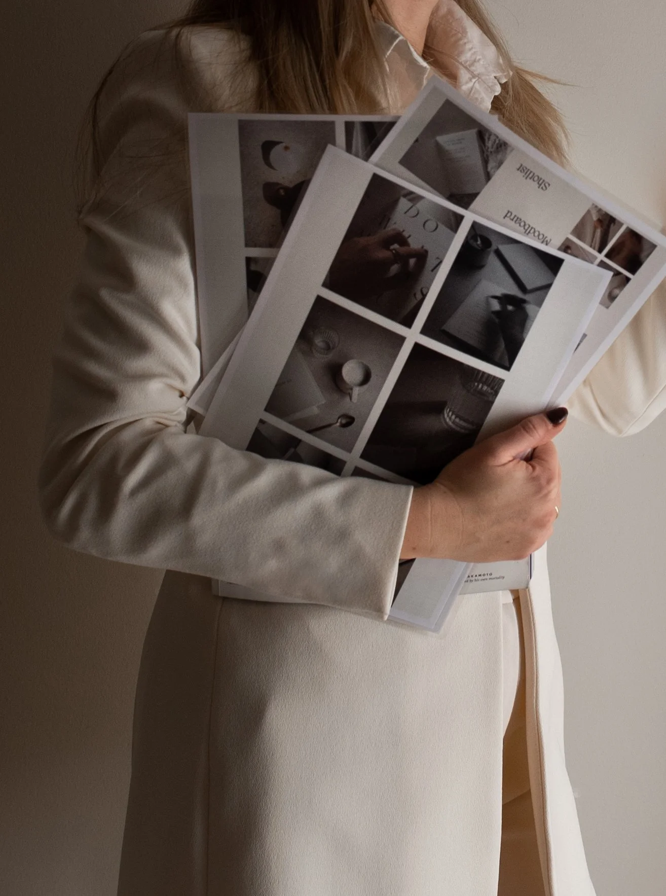
Rather than inquiring about the client’s color preferences, it can be less limiting for the interior designer to create a mood board and ask for reactions. That approach can reduce client resistance and negative responses to specific color options. Viewing a general scheme and providing reactions encourages more open-mindedness from the client, compared to providing answers to specific color preference questions. I think clients are open to being led toward color choices rather than wanting to dictate their own preferences to the designer.
They have hired their interior designer to guide their selections and provide creative solutions after all. Yes, they want their preferences to be respected. But they also want a solution that exceeds their own choices and inclinations. They want professional and aesthetic insight related to color choices, and to a certain extent, they want to be surprised.
Sources:
AI Stanford. (n.d.). Tutorial 1: Image filtering. https://ai.stanford.edu/~syyeung/cvweb/tutorial1.html
Albers, J. (1963). The interaction of color. Yale University Press.
Clemons, S. A. (2021). Interiors: Design, process, and practice, 2nd ed. Goodheart-Wilcox Company.Dresses2022. (2024, September 22). White and gold dress explained. https://www.dresses2022.com/White-and-gold-dress-explained/
Holtzschue, L. Understanding color: An introduction for designers, 4th ed. John Wiley & Sons.
Laroche, M. (2022, October 20). The Bezold Effect -What do you mean your red is different from my red? Psychvarsity. https://www.psychvarsity.com/The-Bezold-Effect
Moran, M. (2024, July 8). Color psychology facts and statistics. Colorlib. https://colorlib.com/wp/color-psychology-facts/
Slotis, S. J. (2017). Foundations of interior design, 3rd ed. Fairchild Books
Sugue, M. (2024, July 23). Statistics on the prevalence of color blindness. https://www.visioncenter.org/resources/color-blind-statistics/
Wikipedia. (n.d.). Color blindness. https://en.wikipedia.org/wiki/Color_blindness
Want to explore more issues? Here are a few favorite past editions:

Want The Design Brief® delivered straight to your inbox?
If you liked this email, be sure to sign up for The Design Brief®, our complimentary publication that gives you bite-sized lessons on all the technical interior design topics you didn’t learn (or forgot) from design school—straight from our resident interior design professor!