
The Design Brief® | Volume XXXI | DESIGN PRINCIPLES: Achieving Balance in Interior Spaces

©️ Dakota Design Company 2017-2026 | All rights reserved. This content may not be reproduced, distributed, or used without permission.
WRITTEN BY DR. GLORIA for DAKOTA DESIGN COMPANY
In previous posts of The Design Brief®, we have covered the Design Elements as they relate to interior design: LINE, SHAPE AND FORM, PATTERN AND TEXTURE, LIGHT, and COLOR.
I use the analogy that the design elements are like the ingredients in a recipe. Choosing to add specific amounts of ingredients (the elements) is how a designer effectively and creatively composes a space.
If the design elements are your raw ingredients—the flour, salt, and spices—then the design principles are the culinary chemistry that determines whether the final dish is a masterpiece or a mess. Think of design principles as the sensory experience that emerges when the elements are combined.
Just as with a well-executed recipe, a thoughtful blend of design elements can result in a savory masterpiece; conversely, a poor combination can yield something bland or even unpalatable. And while a strategic pairing of ingredients can create a harmonious sweetness, an unskilled combination risks a finished product that tastes bitter.
It is in combining the design elements (ingredients) to achieve desired levels of the design principles (interactions) that a designer exercises creative expression and mastery.
Achieving BALANCE in Interiors
We humans strive for equilibrium in many facets of our lives. We manage the highs and lows of stress so that we do not feel overwhelmed. We alternate episodes of mental and physical output with periods of reflection and rest. We maintain our bodies by alternating our focus among nutrition, movement, and sleep. To preserve our mental health, we ensure the energy we give to others is balanced by the support we receive in return, and periods of solitude.
Similarly, we feel satisfied when our surroundings are visually balanced. A lack of balance, or imbalance, disturbs us.
So, it is no wonder that achieving visual balance within a space is one of the key strategies designers strive for in a well-composed interior. Visual balance is achieved by selecting and arranging interior furnishings and design elements to suggest equilibrium within a room setting.
What Happens When Visual Balance is Lacking?
When there is a lack of balance, or a sense of equilibrium does not exist within a space, the aesthetic will seem random and arbitrary (the way many homeowners arrange their home interiors!!). When lacking, visual balance can typically be achieved by adding elements and furnishings, eliminating specific items where visual clutter exists, and by shifting or relocating items to new locations (add, eliminate, relocate).
Sounds simple. But it is the question of what to add or delete, and where to add and delete, that comprises the artistry that a designer must achieve. Most designers seem to have a good innate sense to identify where an imbalance exists. But, just as a musical composer chooses precisely what notes and rhythms to include in a composition, a designer thoughtfully chooses what elements and flourishes to add in specific locations.
The image below illustrates a lack of balance with the decorative items above the fireplace (although this may have been the designer’s intention to create emphasis). Using the add, eliminate, relocate approach described above, it would be easy to achieve balance by adding a decorative accessory to the left side of the mantel, or relocating one of the candlesticks from the right to the left.

Formal (or Symmetrical) Balance and Informal (or Asymmetrical) Balance
When we evaluate visual balance, we most often naturally assume balance around a vertical axis. That is, the question we strive to address is whether what is on the left of our visual field is balanced with the right side of our visual field. It is rare that a design issue is related to balance around a horizontal axis —that is, whether an interior space looks top-heavy or bottom-heavy.
In formal balance (below left), there is a repetition, or near repetition, of all elements on both sides of an actual or perceived vertical axis. With informal balance, (below right), the left side and the right side are not mirror images of one another. Instead, the two sides of the visual field are balanced because they have relative visual weights.
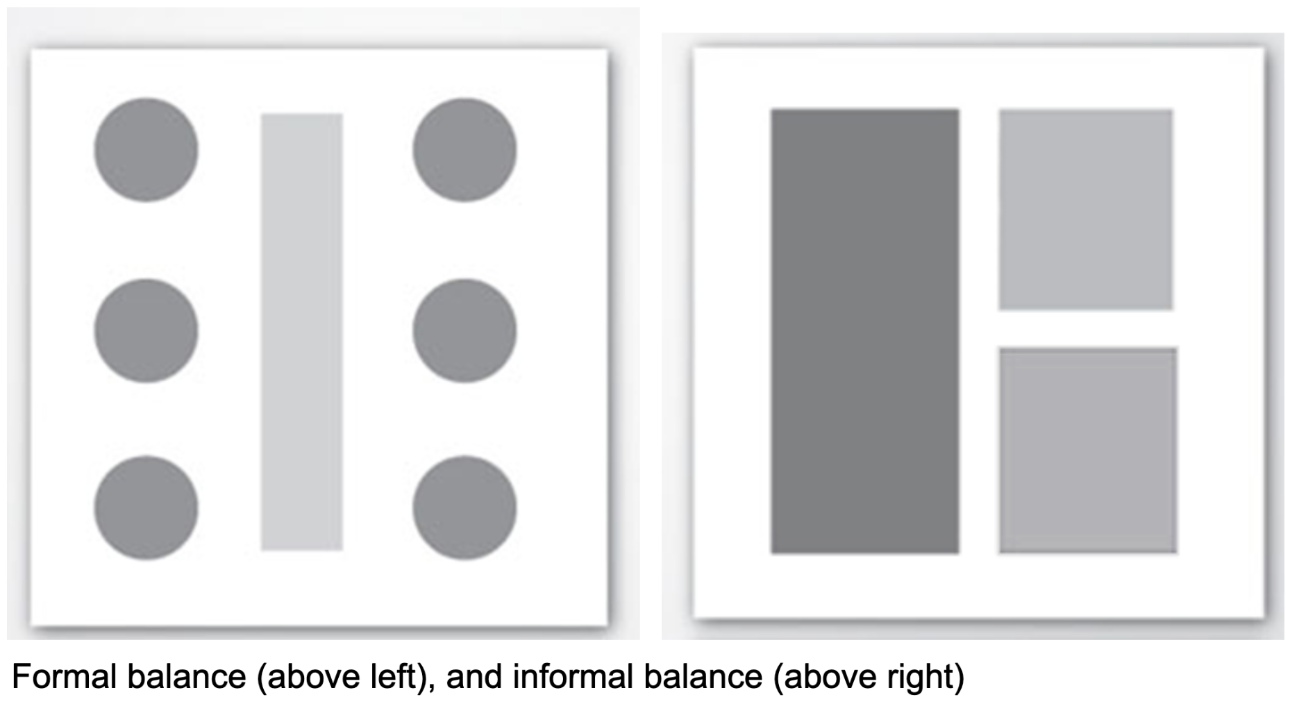
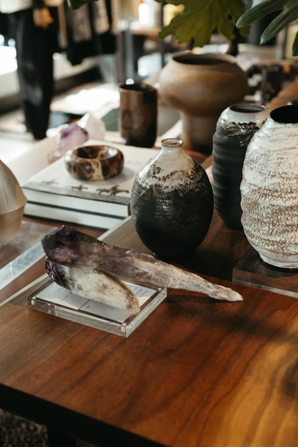
Above, the image on the right has one darker element on the left of a perceived vertical axis, and two elements on the right. But the two are slightly smaller and slightly lighter than the single element on the left. One darker element balances with two lighter elements. Size, quantity, color and value, texture, positioning, and complexity of elements all affect their visual weight (further described below).
Formal Balance
First, let’s look at spaces with formal (or symmetrical) balance. There is a mirror-image repetition of all design items in the space around a perceived vertical axis. That axi

Not every single item needs to be exactly duplicated for formal balance to exist. Note that the items on the coffee tables in the two examples above differ. But overall, strong repetition around the perceived vertical axis exists.
Formal balance is more often used in traditionally designed rooms than in contemporary spaces for several reasons. Traditional interiors typically draw from historical precedents in furniture and decor. In previous design periods, such as the Baroque and Neoclassical, furniture was often arranged symmetrically to convey power and stability. And because symmetrical balance utilizes matching pairs of items, rooms will feel very curated and established, which aligns with the dignified atmosphere of traditional estates and formal spaces.
Symmetrically balanced rooms—with repeated, matched pairs of items—can seem static or rigid, and perhaps not conducive to a relaxed, kick-your-shoes-off-and-put-your-feet-up atmosphere.
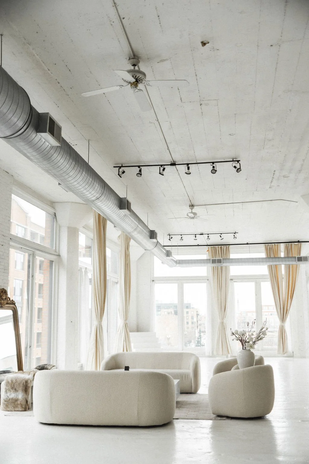
Informal Balance
Informal (asymmetrical) balance is favored in contemporary spaces because it suggests movement, spontaneity, and casualness. Modern life is much less rigid than that of our ancestors in so many ways, so spaces designed with contemporary furnishings often seem to call for a more relaxed arrangement that lacks symmetry.
The calculated off-centeredness of contemporary design feels more relaxed and approachable. But the key is that the composition of the space still feels balanced, just in an asymmetrical way. Instead of matched pairs, informal balance relies on visual weight, rather than symmetry, to create balance.
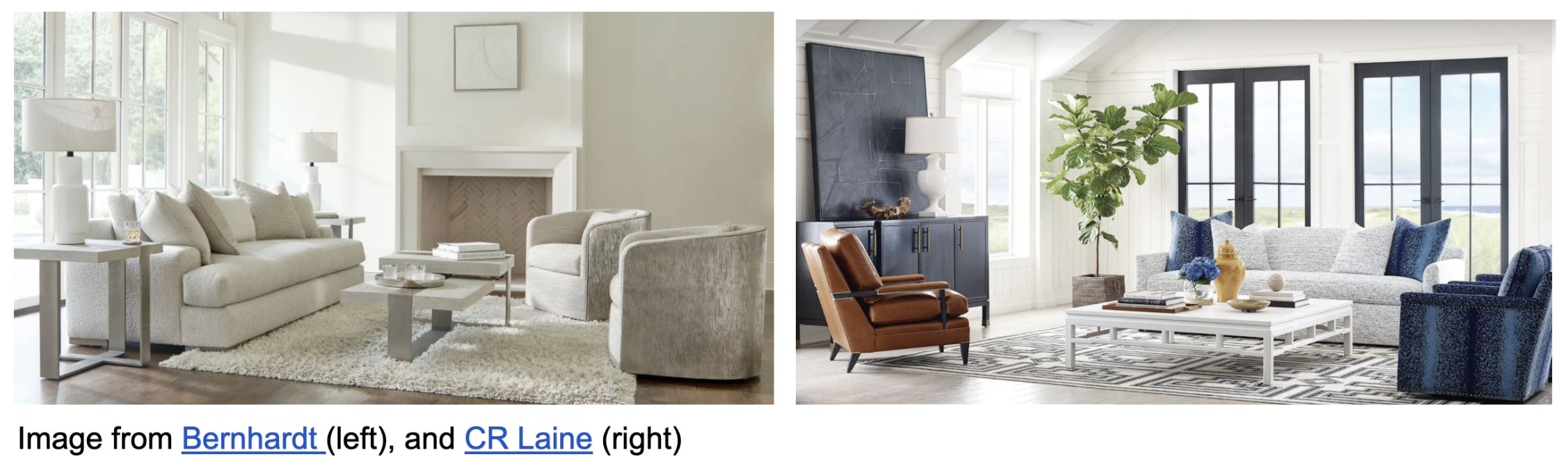
Whereas the equation for symmetrical balance may be thought of as A+B = A+B, the equation for asymmetrical balance is A+B=C. With the living room image above left, the one large sofa on the left balances with the two smaller chairs on the right. Asymmetrical balance feels more active and casual, yet maintains a pleasing visual equilibrium.

Factors that Increase Visual Weight
When achieving informal balance in a room, the visual weight of its furnishings and elements must be taken into account. Size, quantity, color and value, texture, positioning, and complexity all affect visual weight. Items with greater visual weight have greater visual dominance.
Size: Larger objects naturally look visually heavier than smaller ones.
Quantity: More items are heavier visually than fewer items.
Color & Value: Bold, saturated colors (like vibrant red) carry more visual weight than muted pastels. Similarly, darker values (black) feel heavier than lighter values (white).
Texture: Complex, rough textures have greater dominance and therefore more visual weight than smooth, flat surfaces.
Positioning: Objects placed closer to where the viewer will observe them have greater visual weight than those seen from a greater distance.
Complexity: Intricate shapes or items with more details have a denser visual feel, therefore, they are more visually heavy. Simpler shapes and forms are visually lighter.
The images below illustrate these concepts. The larger white ball balances with the smaller red ball, because the color red carries more visual weight than white, compensating for its smaller size.

The single vase and complex foliage (larger size, greater complexity) on the left balances with the two candles and candlesticks on the right (greater quantity).

Is Visual Balance Always Required?
There is a well-known quote from Pablo Picasso:
Learn the rules like a pro, so you can break them like an artist.
Designers often go against the tried-and-true standard conventions of design to create something truly innovative. So by no means does balance have to exist within every interplay of interior elements. The image below illustrates a deliberate disregard for balance in order to create emphasis.

Placing one red pillow on either side of the sofa would be more balanced, but the arrangement with both red pillows together emphasizes them, a deliberate choice to break the rule of balance.

Want The Design Brief® delivered straight to your inbox?
If you liked this email, be sure to sign up for The Design Brief®, our complimentary publication that gives you bite-sized lessons on all the technical interior design topics you didn’t learn (or forgot) from design school—straight from our resident tenured interior design professor!