
The Design Brief® | Volume XXXI | DESIGN PRINCIPLES: Creating a Sense of Cohesion: UNITY in Design

©️ Dakota Design Company 2017-2026 | All rights reserved. This content may not be reproduced, distributed, or used without permission.
WRITTEN BY DR. GLORIA for DAKOTA DESIGN COMPANY
We have covered the design elements—I liken these to the ingredients in a recipe—Line, Shape and Form, Pattern and Texture, Light, and Color in previous posts.
And we have explored the design principles—the strategies for carefully and effectively combining the elements—by utilizing Balance, Rhythm, Scale and Proportion, and Emphasis and Focal Points—more recently.
I have left the final design principle: UNITY for the final post in this series. Why? Because Unity is the overriding and cumulative way in which the contents of a room are woven together into a cohesive whole, transforming a collection of beautiful pieces into a singular, intentional experience. Without it, a room is merely a showroom of disparate items; with it, a space feels resolved, harmonious, and complete.
UNITY Defined
If an interior space is unified, that means that a congruity or agreement exists among the elements in the room; they look as though they belong with one another, as though some visual connection beyond mere chance has brought them together.
UNITY is synonymous with HARMONY. If various elements appear separate or unrelated, the composition falls apart and lacks both UNITY and Harmony.
Unity (or Harmony) in a composition is the agreement of the parts to each other and to the whole. Unity results in a composition in which all the pieces seem to belong together and work to reinforce the overall design theme.
How is Unity Achieved?
There are many tactics to unify a space, several of which we will cover here. The key is that the selection and placement of items in a room be strategic and well considered, not haphazard.
Achieving Unity through Proximity
Simply put, placing elements close together makes them look as though they belong together. Conversely, spacing items further apart eliminates the sense of connectivity.
Let’s look at a simple, familiar example.
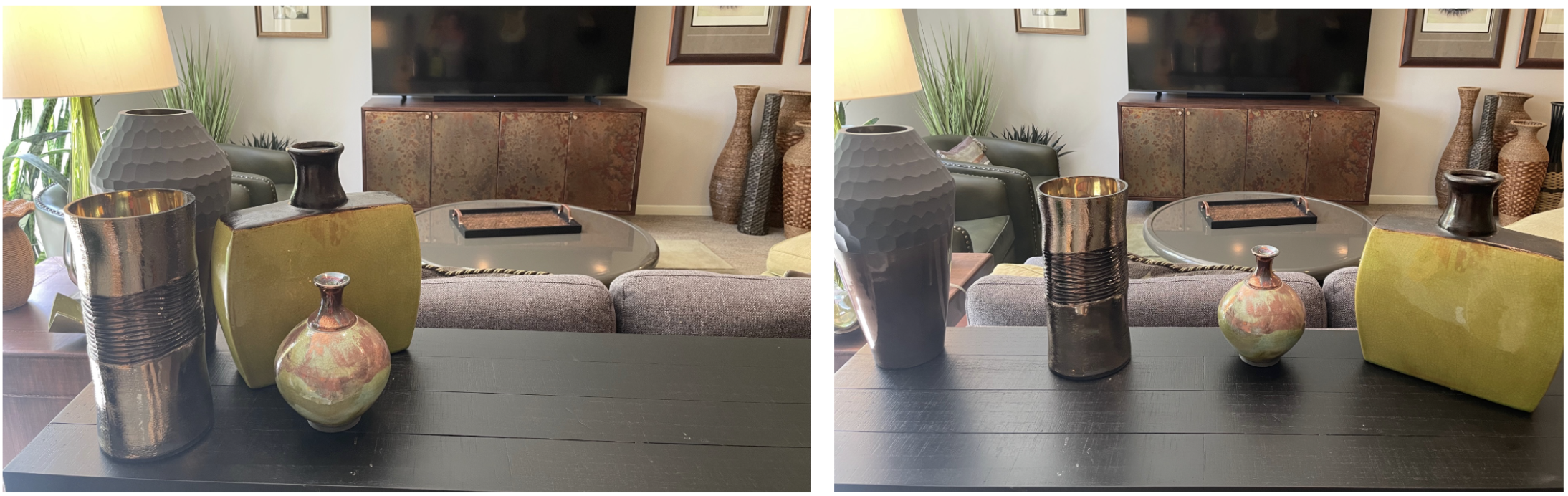
These decorative accessories (below left) appear to belong together simply because they are grouped together in close proximity. Spread them apart (below right), and they seem disjointed and unrelated.
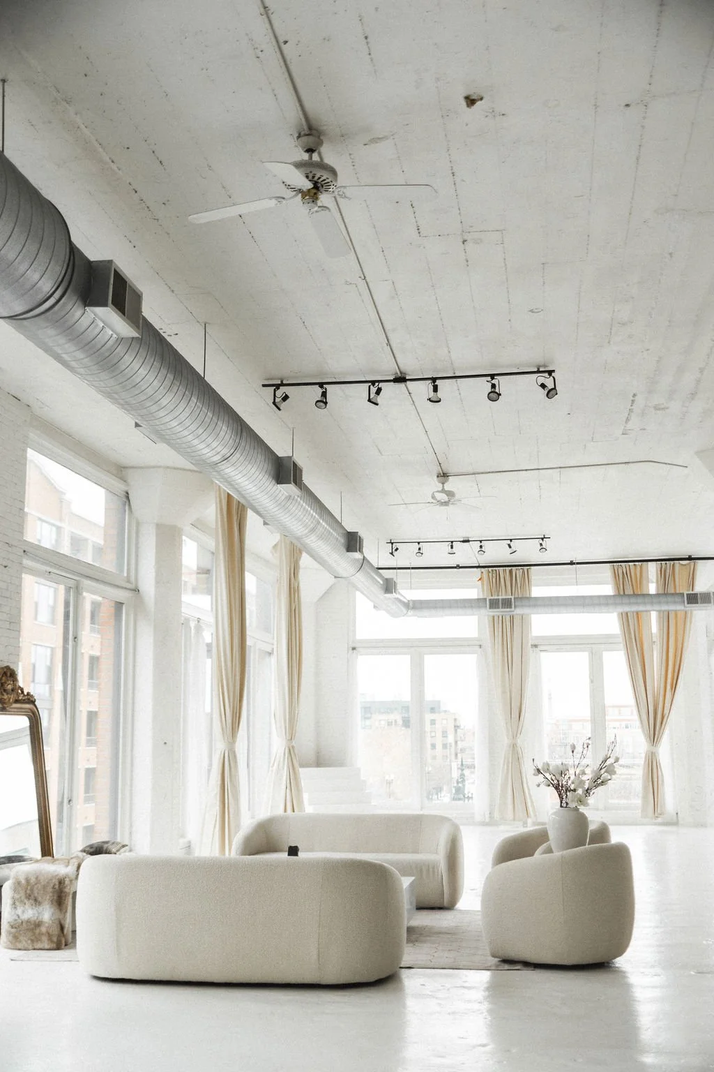
The same is true when looking at more complicated arrangements of elements: proximity results in cohesion. In a space with multiple seating areas, the placement of items in the same vicinity makes them appear to belong together.
Placing items close together to signal they belong to the same "family." Conversely, elements that are at a distance or remote from one another are not perceived as being linked.
The space below has two separate seating areas. It is clear that there are two distinctly unified groupings of furnishings just by the nature of their proximity.

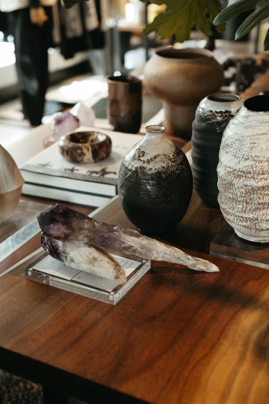
In the image below, there are two strategies used to make this grouping of dissimilar framed art pieces appear as a cohesive whole: proximity, and the repetition of the sepia tones in each piece. Placing these art pieces close together visually ties them together as a unit. The common coloring, or repetition of tones, is also a unifying strategy. Read on.

Achieving Unity through Repetition
Repetition of similar shapes, colors, or materials throughout a space creates a visual integration. Something in the design is repeated to relate the parts to one another.
Because all of the individual framed wall art pieces in the image above have similar brown and gray tones, they work beautifully together to create one, integrated whole art display.
Using repetition is a natural unifying strategy that designers use without giving it much thought. Colors or patterns are repeated as a unifier, particularly in more traditional interior spaces. In the room below, the blue tones and open lattice patterns are repeated several times, making the room appear very intentional and cohesive.

Using repetition of colors, shapes, patterns, materials, motifs, and elements as a unifying strategy, is closely tied to the design principle of Rhythm, and using repetition to guide the eye around a space. Read more about that here.
Repetition helps connect everything together. But a note of caution about utilizing repetition as a unifying strategy: it can be overdone to the point of uniformity. Too much repetition, with strict duplication, creates an environment that is lifeless and dull. Utter regularity is not at all satisfying.

The “matching set trap” is a common pitfall homeowners fall into when selecting already matched items from a manufacturer or retailer. Elements that are too matchy-matchy are uninteresting together, and feel static and sterile, such as with the bedroom suite below. Some variation in the furniture pieces within a bedroom would be much more satisfying.

So yes, while repetition brings unity and order, for an interior environment to feel alive and sophisticated, a bit of variety and tension among elements is required. Designers must balance variety and repetition, ensuring that every texture, color, and form contributes to the overall narrative of the environment. Think of it as a well-crafted recipe: while each ingredient has a distinct flavor and purpose, they must all work in concert to create a balanced, satisfying, and aesthetically pleasing dish. When unity is mastered, the viewer no longer sees just the "ingredients"—they experience the finished masterpiece.
A well-designed space should contain elements with shared characteristics that look like they were collected over time, rather than purchased in a single afternoon. Some repetition of some characteristic will connect disparate elements, making the space feel cohesive

Achieving Unity through Continuation
This could be thought of as the “common thread” technique. By facilitating a fluid transition from one space or element to the next—often through the continuation of architectural details—a sense of cohesion is established. We are all familiar with the visual "nightmare" of mismatched flooring materials clashing at every threshold; to avoid this fragmentation, there must be a semblance of continuation, such as consistent flooring throughout a space. Continuation, naturally, means that something continues—a line or shape, a shared material palette, a consistent color story, a repeating linear element, or a recurring motif. These threads must weave from one room to the next in order for the environment to feel like a singular, intentional narrative rather than a collection of disjointed ideas. The viewer’s eye travels smoothly from one element to the next.

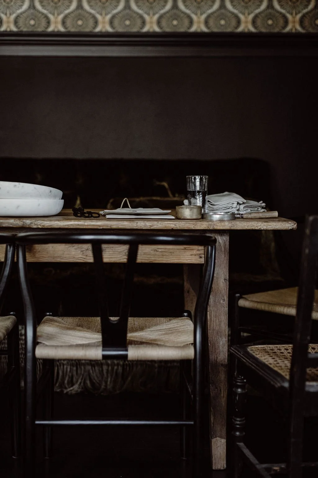
The image below illustrates a continuation of consistent flooring, architectural ceiling details, and metal stairway components, paired with the repetition of white tones and natural wood elements, to weave a cohesive narrative through the space.

Achieving Unity through Utilizing a Grid
In the same way that placement plays a huge role in creating unity through proximity, the placement of elements, especially where there are many, within a grid format—that is, in approximate rows, or some regular pattern—is a foolproof unification strategy. Some may think gridding would result in a static and monotonous arrangement. But no, a regular pattern in the placement of elements actually satisfies a human need for order in our visual landscape. And in this order, we find visual satisfaction and cohesion.
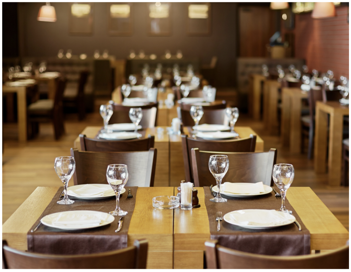
Imagine if this restaurant had tables positioned haphazardly and at different angles. Not only would that be frustrating to navigate physically, but it just would not appear ordered or settled. Some semblance of visual order is needed for us to feel visually satisfied.

Strictly gridded furniture arrangements, like the one above, are more often used in traditional interiors as opposed to contemporary, and, yes, there can be a bit of tedium in formally symmetrical and linear furniture arrangements. But the fact still remains that a gridded arrangement makes sense to us visually. And when it makes sense, we perceive it to be cohesive, unified, and satisfying.
We naturally arrange furniture this way, without even considering that we are establishing a gridded arrangement. Not all furniture arrangements are as linear as the one pictured below, but furniture is typically arranged in some semblance of a regular pattern.

Achieving Unity through Incorporating a Theme
A thematic concept easily unifies a space. It is achieved by selecting several elements that relate to a concept, a narrative, a locale (the where), or a period (the when). The nautically-themed room below illustrates this idea:

Themed rooms offer a straightforward path to visual unity by selecting various pieces that relate to a theme. It is like having a predetermined ingredient list: textures, colors, and motifs that naturally relate to one another through a unifying concept.
Whether it is the airy serenity of a coastal retreat or the rugged warmth of a mountain lodge, the theme serves as a conceptual anchor, guiding every selection from furniture to hardware to accessories.
This approach is particularly effective in spaces like children's bedrooms or vacation rentals, where a clear narrative adds a sense of playfulness and cohesion. However, it is easy to overdo a themed room until it feels more like a display exhibit than a living space. It is important to focus on subtle nods to the concept rather than literal interpretations. Think of the theme as a subtle underlying connector, rather than a dictate for the selection of every item.
Using the Strategies for UNITY to Create Better Presentation Boards
In my 15 years of teaching undergraduate interior design students, I initially struggled to articulate strategies to help them improve the quality of their presentation boards. Often the placement of images and material samples on their boards felt haphazard and arbitrary. And, with a set of boards for the same project, there was no consistency of unifying factor among them. But how to articulate to students what they needed to implement for improvement?
I finally realized that the same strategies that are used for creating UNITY in a space also apply to creating unified presentation boards. Let me give you an example.
Here is a presentation board that could use some improvement. There is no logic to the layout of the images on the page. It is just a collection of images randomly placed:
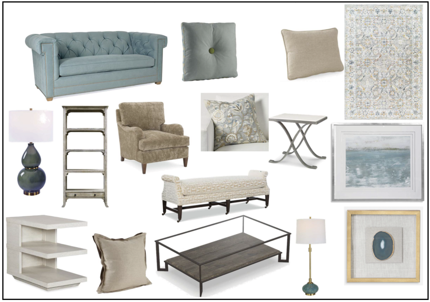
By using the strategies of PROXIMITY and USING A GRID, this board layout can be easily improved.
We want to position the images so that they are in approximate rows or columns:

We also want to consider the proximity of the images on the board relative to their actual positioning in the space: the coffee table should be on top of the rug, the end table should be beside the sofa, etc. And items that will be positioned low to the ground should be at the bottom of the board. Items that will be positioned higher up in the space—like wall art or a ceiling chandelier—should be positioned near the top of the board.
So, an improved board layout might look something like this:

Now, REPITITION as a unifying strategy comes into play with the formatting of presentation boards. Each board should have the exact same formatting for consistency, so that multiple boards are cohesive with one another.
Consider the two design boards for the same project below. They do not appear to be a “set.” There is nothing that unifies them as being part of the same design project.

But if we repeat some formatting on each of the boards, it will be understood that they are part of a “whole” and belong together. That formatting may be in the form of a page header or footer that includes information such as: the design firm name and logo, the project name, the room name, and/or the date. Note how these two boards, with repeated headers and footers, are very nicely aligned and easy to “read.”

What to Remember About UNITY in Design
Achieving unity in design involves several straightforward strategies: grouping items to establish proximity, repeating common characteristics, extending elements throughout a space for continuity, aligning elements in a logical placement or grid, and anchoring the design with a cohesive theme. Ultimately, these techniques transform individual elements into a harmonious composition where every piece feels connected to the whole.
Sources used:
Lauer, D. A., Pentak, S. (2012) Design Basics 9th ed., Cengage Learning

Want The Design Brief® delivered straight to your inbox?
If you liked this email, be sure to sign up for The Design Brief®, our complimentary publication that gives you bite-sized lessons on all the technical interior design topics you didn’t learn (or forgot) from design school—straight from our resident tenured interior design professor!